
Why product marketers should copy Vimeo's homepage
Website homepages are an introduction to who you are and what problems you solve. But when companies forget this and start to clutter their homepages with unnecessary information, the homepage feels less like a greeting and more like a tangent-filled monologue.
Even if you have a complex product, your homepage can still be simple. Vimeo’s homepage is a textbook example of this.

First, the page’s hero line grabs your attention with an empowering statement that conveys what Vimeo can do for you. The tagline calls out that Vimeo’s products are simple to use but produce high-quality results. This is important because video software can be complex and overwhelming, but their target customers want a painless tool that still produces professional content. Vimeo is differentiating themselves from their competitors here (i.e., introducing their positioning).
Then, there’s a clear CTA: you can view Vimeo’s plans or join for free. Great.
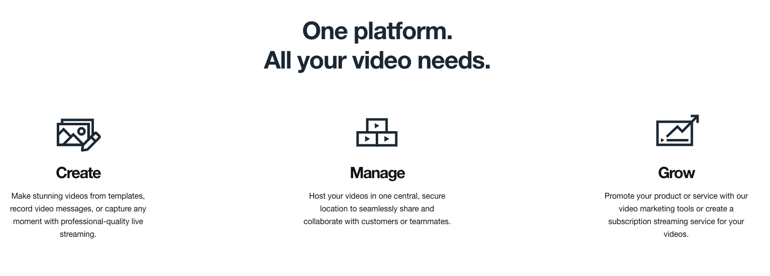
Next, there’s another hook that introduces some of their features and benefits. In the hero line, they promise to be a one-stop-shop to solve your video challenges. I love how they group some of their product’s nuts and bolts into three buckets—create, manage, and grow—so the viewer can easily imagine how they’d use Vimeo over the course of a project.

Now the viewer is probably wondering if they should trust this product over others. So Vimeo introduces social proof. Leaders at three companies share why they love Vimeo in 1-2 sentence quotes. People love real-world examples of how others are using a product. Other household name brands are listed as Vimeo customers.

To wrap everything up, Vimeo provides a final call to action—see what this product can do for you and try us for free, they say. The copy is inviting and straightforward. The viewer's next step is clear, easy, and costs nothing.
Vimeo’s short homepage is easy to read, takes only a few seconds to scroll through, and covers all the product marketing fundamentals of a great homepage. Vimeo could have overwhelmed the viewer with all their product features, but they chose to keep a clean layout with short copy. The homepage conveys what Vimeo’s entire user experience would be like: simple and easy to use.
One change they could consider introducing: I love how Slack’s homepage includes 15 second “how-to” videos on how to use their product. Help content like that is golden. Vimeo could add three of these kinds of videos in the features/benefits section.
